Dear Insane Children,
One of the themes I discussed while at the recent Patreon Assembly in Los Angeles was the idea of Missteps as Content. And how this is a radical notion in a world of glitzy product launches, review embargos, and Rotten Tomato’s faked freshness.
My premise is one you’ve heard before: Embrace your failures. Also known as “if you aren’t failing regularly, you aren’t trying hard enough.”
A lot of creators I spoke with shared a feeling I know very well… that we shouldn’t go public with a thing until it’s 110% final. We don’t want the world to see our ideas before they’re fully formed – because we fear ridicule and rejection. But that fear excludes our audience from the creation process.
Sharing is scary. Sharing our mistakes? Yikes!
What Are Patrons?
When I think of “patrons” of ye olde times, I imagine them peering over the shoulder of the musicians, painters, sculptors, and sailors they financed. They witnessed as plans were made, ideas sketched, and marble chiseled. They heard and saw the mistakes – and that made their appreciation of the final product that much richer.
Part of the benefit of being a Patron is a behind-the-scenes view of a work in progress and a chance for creative involvement – something the general public will never see.
Well… maybe the general public never should see…

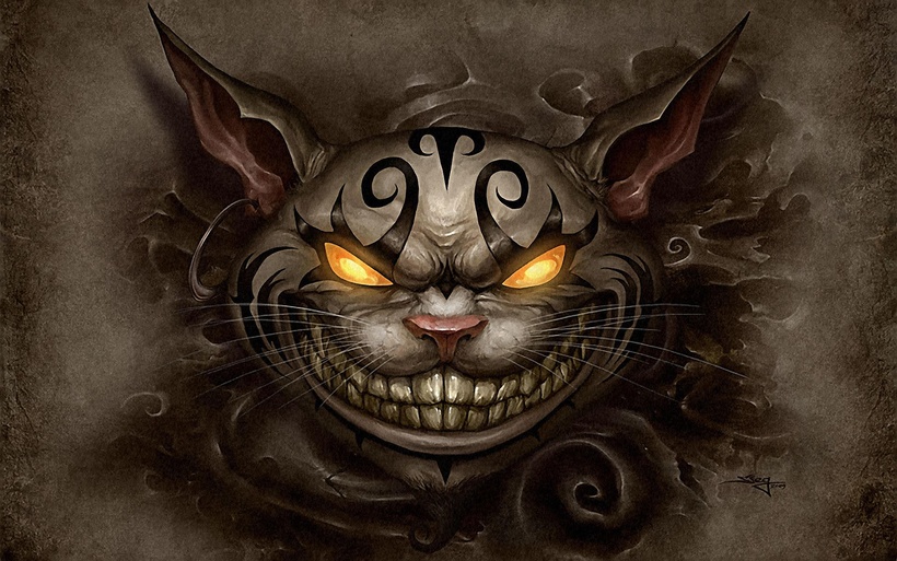
This is a Cheshire Cat “cake” I was reminded of when Jen sent over the Cheshire Face Enamel Pin concept image (main image, above). This is actually the second-worst thing I’ve ever seen done with the Cheshire’s face.
(If you want to see the first-worst thing (you don’t) then there’s a pr0n tattoo (NSFW) someone did (why?!) which you can see HERE. I’m telling you NOT to click on that link. If you do, it’s your own fault if you can never see Cheshire the same again.)
Ahem…
Where Were We?
So I am not a fan of the first-round version of the Cheshire Cat Head enamel pin. But that’s OK. It gives us a starting place for heading towards the final destination. And in this revival of the Patron-Artist-Relationship, it gives us The Creation Process as Content.
Here’s the note I wrote to Jen with my thoughts on her original version (top image) vs. the sinister version I shared with her as an example (image above).
Where I prefer this (sinister) version:
1) removes the pupils so that you don’t get the “eyes rolled up into the head” look
2) flattens the proportions and moves the center of the face down – looks more sinister, less goofy
3) reduces the amount of teeth shown – again, less goofy, more sinister
4) brings the ears down a bit so he looks more angry, ready to pounce
5) slants the eyes down – same effect as #4
Maybe I should just state this style direction from the start…
Let’s make this set of pins to be like the Specter Ring from the Bond films. Dark, sinister, belonging to a secret group of mysterious Insane Children. When viewed by people outside the group (cult) raises questions about relationship to magic, the occult, and S&M sex dungeons. Keep them simple… black, silver, and a touch of (single) color when/if needed. The cat? Black, silver, and a single color (yellow looks nice above) for the eyes.
Our Final Destination(?)
Now it’s your turn. Jen’s turned in a new variation…

Let us know in the comments below what YOU think! Join the process! Give us your feedback!
From Shanghai with I Told You So,
-American