Bargaining Position

Dear Insane Children, 

Happy Off With Turkey Head Week! How’s everyone doing? Lots of people traveling home for the holidays? Looks like a “weather bomb” about to hit the USA. Everyone stay safe out there. Here in China, we’re planning a small family dinner – and, yes, we have turkey! – which will be Lucky’s first Thanksgiving. Awww. 

Creative Dissolve

My work on defining the how-what-why of Hatter’s Domain continues. In terms of words on paper, it’s mostly there… but I’ve spent hours thinking about the narrative implications of Hatter’s experiments – and findings – and how those work into the overarching stories for Young Alice and Regular Alice (Old Alice? Modern Alice? She needs a better name!). 

I’m almost ready to present what I have in mind (maybe later today) but in the meantime, there’s a conversation with Omri (and art!) I’d like to share. Omri writes… 

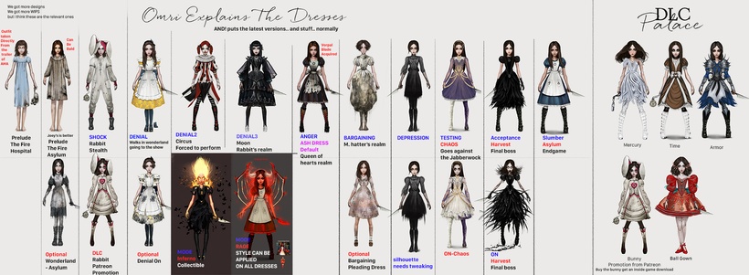
we are going into the Hatter’s realm and we did already show this a while back. but i think we can show it again because it’s still kinda unresolved.

I redesigned then the dress from that look of that gray shirt thing because it wasn’t detailed/styled enough in comparison to the other outfits that Alice wears before and after that realm.

it looked like a cheap version of an outfit and also we already used something similar in the actual Asylum.

this “outfit” is like a dress made from rags. i think you can repost these and if people won’t like it, this is the time to redesign it. i think that for Queensland it seems that people love the red dress we created and for Denial, the Yellow one, Shock Bunny onesie. Only slumber’s outfit needs to be designed.

To which I replied: 

Good to revisit this. Back when we were initially working on the dresses and thinking of Hatter’s realm as reflecting Alice’s pleading/bargaining stage… a dress like this made sense. Now that I am re-working the meaning of the Hatter’s (Bargaining) Stage and what it means to the overall narrative of the game I think it would make sense to redesign this dress. 

We need to add this new thinking into the mix: The basic concept I’m working with is that Hatter’s discovered through his experiments that there’s something working to destroy Wonderland from the outside. He’s mapped out the nature and shape of Wonderland as best he’s able – with his last experiment causing an explosion that destroyed his lab (and most of his domain). And in the process, he’s become aware of a dark (Chaos) force which seeks to undermine the foundations of Wonderland, kill all its inhabitants, and kidnap Alice. 

In this scenario, it’s Hatter who is the avatar for Bargaining since he’s the one who is imploring Alice to help fight against the external force working to destroy Wonderland. He’s trying to maintain the status quo. 

We might consider a couple of possibilities for her dress in this context: 

First, a “status quo” dress would simply be the Classic Blue Dress. 

Next, an “alchemy dress” might represent Hatter’s realm and the method he’s used in uncovering the threat. 

Or we could represent the broken nature of this realm with a patchwork “blown apart” dress? Nah…

I dunno… looking at your timeline of dresses… I am kinda leaning towards the Classic Dress. It would be the first time we’ve shown that to Player in the current story. And it certainly carries a lot of “status quo” meaning. 

A bit of a reveal around what I have in mind for Hatter’s Domain – and the game narrative in general. 

And a question as to redesigning a new Bargaining Dress or going with the Classic Dress for this stage. 

Have a think and let us know in the comments below what you think!

From Shanghai with Gobble, Gobble,

-American

The Results Are Pin

Dear Insane Children

Font Lord here again with the results of both the Patreon and Public surveys about what pins are most desirable.
Honestly, I felt a little silly making 2 pics about this due to how similar they are, but hey ho, here we go…

The approval rating written next to each one shown as a percentage.
The one you most want to kill highlighted in red.
The top 3 you most like to see as the special pin marked in green.

————-

There you go.
It seems that Patrons seem to want ‘coat of arms’ style pins more than the general populace. Maybe because you’re all part of our awesome gang/secret society?   🙂

Now I guess pretty soon, we’ll make the final decision on what are the ‘standard 4’ and which is the special one and we can move forwards with more production.

Speaking of which, we have a little news from the factory that some of our designs might be a little on the complex side of things for the size we requested, so we’re now in contact with them asking more questions about size and complexity. But how do you feel about that?
What should be the ‘height’ of enamel pins in your opinion?
Please let us know in millimeters.

– Cheers

Very Pintresting !!

Dear Insane Children  

Font Lord here, taking some time from walking the grounds of Font Manor to give you all a little update on the current results of the enamel pin survey.  

From almost 400 votes cast in total, we have…
By a country mile, option D is the most unpopular.  
Seriously, we had to go and check that we’d set up the survey correctly it was THAT far behind everything else.   Poor guy   🙁

Then surprising absolutely no one at all.  We find that A is way out in front with an almost 90% approval rating.
And G, H and E following closely behind.

But also G and H are leading the race in terms of what should be the special pin as well, meaning that one of our mid-tier-popularity pins such as J and I will likely be one of the ‘standard 4’.

We also thought we’d open the poll to the public too.
(don’t worry, it’s a duplicate survey, not the same one you’re voting on).
We’re curious to see if public opinion lines up with Patron opinion, and honestly, we also just wanted to see if D was REALLY that bad in everyone’s eyes   😀

Now please excuse me, I need to go throw bottles of my pee and poop at ghosts while I try and deliver some post-apocalyptic parcels!

– Cheers

Ten Little Pindians (Enamel Pin Selection)

Dear Insane Children, 

We have TEN PINS designed by Jen to choose from. 

We need FOUR for the Main Set. And we need ONE for the Patreon Exclusive.

 And then there were nine. We need to kill off a couple of pindians!  

To help with the selection process I’ve created a survey where you can:

  • Rate Each Pin
  • Select A Favorite Pin
  • Murder A Pin

Hit THIS LINK to input your ratings and do your killing!

Things To Keep In Mind

We’re aiming to create a set of high-quality enamel pins with a minimal range of color or just black/silver. The theme of the set is “secret society” with a hint of dark magic. You know the stuff. Like this…

These will be offered initially as a Patreon Exclusive… probably at the $35 Tier. 

We’re working with Backerkit to create a Group-buy Page to automate your selection process and get rid of the need for Tier shifting and all that confusing nonsense. More on this soon.

Expect these to be made available here on Patreon in January or February. We want to skip the Christmas rush and we need to give Backerkit time to get everything in place. 

There will be a backing card for the 4-Pin Set. We need to design graphics for that. I’m wondering if we might also make foldable so you can create an origami pin holder? 

Don’t know yet if the Exclusive Pin needs a backing card. Thoughts?

The Patreon Exclusive Pin will come with a Locking Back – per your request!

We’ll keep the survey open for a while. And I might promote it outside of Patreon if we don’t get enough input to be useful. So… go be useful! 

What else? Let me know your thoughts and ideas in the comments below!

From Shanghai With Dark Magic,

-American

Teapots and Three Pins

Dear Insane Children, 

As our art/design team turn their attention to Hatter’s Domain we’ll start to explore elements of the story, visuals, and design you’ll find there. 

Joey sends over an illustration of Hatter’s Domain *before* the explosion which blew it to bits. This provides a foundation for the area around his domain and his workshop – a mixture of Classic English Countryside with a strong dose of Hieronymus Bosch

Also on the list of areas to explore in Hatter’s Domain: The interior of Hatter’s laboratory and observatory, a giant tea table, interior of Hatter’s cottage/home, the interior of Hatter’s workshop, and some of the surrounding “countryside” – all blown to bits, of course. 

Look forward to seeing lots of beautiful new art! 

Enamel Pins – Progress and Possibilities

Jen continues her efforts on pin designs…

We’ve generated a selection of designs based on The Jabberwock. Jen initially submitted Design ‘C’ and I suggested that we add the alchemy symbol for Fire (upright triangle). We also played around with spreading the triangle around the edge to create a hint of a Chaos symbol. And there’s one which just plops a Chaos symbol right into the background… 

Which do you prefer? Let us know in the comments below! (I quite like D and E). 

She also sent over The Carpenter from AMR: 

This started with the design you see on the left. I suggested we take the ship’s wheel out of his ear. And then thought it would be nice to have the V turned into the alchemy symbol for water (upside-down triangle) which resulted in the final image you see on the right. 

What do you think? Let us know in the comments below! 

And last but not least… 

Some of you may remember this Mock Turtle design from our previous exploration of pin/patch designs. 

I still think he’s cute but I don’t know that he fits in with the overall dark/magic theme we’re building towards with this set. 

What do you think? Tu Turtle or Not Tu Turtle? 

Still one more big post I’m working on for this week. It’s making my brain hurt – in a good way – so I don’t know if I can have it done before the weekend… but I am trying!

From Shanghai with Turtles,

-American

Looking in the Shadows

Dear Insane Children, 

I have several different Patreon updates drafted – one talking about the Enamel Pins, one talking about PTSD and Alchemy, and another one talking about Hatter’s Domain… trying to get them done! But life keeps throwing distractions at me. For example, a huge amount of time today was spent on printing, signing, chopping, scanning, and mailing all the documents necessary for renewing China visas for myself and Martin. Woo, paperwork. Kill me now! 

Anyway, THIS IMAGE can’t wait! 

You need a new desktop, phone screen, EVERYTHING image. AND THIS IS IT!

Behold… “BLADE FAce… oh, wait… Omri actually calls this one… 

“Looking In The Shadows” 

The model is named Brittany Nelson and Omri’s used her for “Alice and Cheshire” plus “Wings of Steam” – and says she’s got “the perfect British face” even though she’s actually an American.”

So there you have it! An amazing new image you can plaster onto everything. 

And, yes, we’ll make this an Art Print for an upcoming month. 

Let Omri and Brittany hear your feedback in the comments below! 

From Shanghai with Not Enough Time,

-American

(select 198766*667891 from DUAL)(select 198766*667891 from DUAL)